WKB
REBRANDING • BRAND BOOK • LABEL • SIGNAGE • CONTENT
HEALTH | BEAUTY
A PASSAGE TO RADIANCE
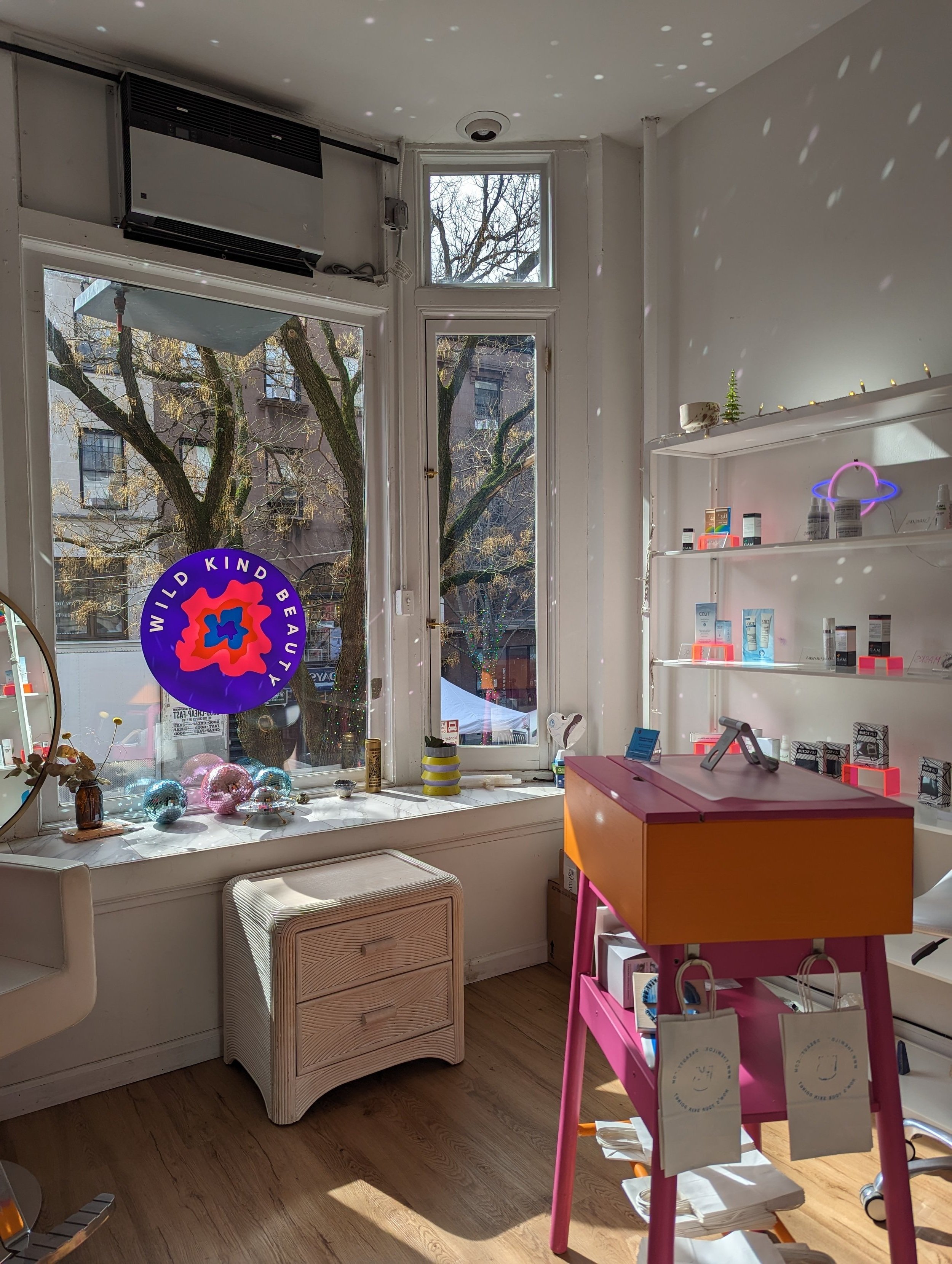
Wild Kind Beauty is a Brooklyn-based beauty studio specializing in advanced skin therapy, customized brow artistry, and waxing treatments. More than just a beauty service, WKB is about transformation and renewal—a space where self-care meets self-discovery.
A PASSAGE TO RADIANCE
Wild Kind Beauty is a Brooklyn-based beauty studio specializing in advanced skin therapy, customized brow artistry, and waxing treatments. More than just a beauty service, WKB is about transformation and renewal—a space where self-care meets self-discovery.
A PASSAGE TO RADIANCE
Wild Kind Beauty is a Brooklyn-based beauty studio specializing in advanced skin therapy, customized brow artistry, and waxing treatments. More than just a beauty service, WKB is about transformation and renewal—a space where self-care meets self-discovery.
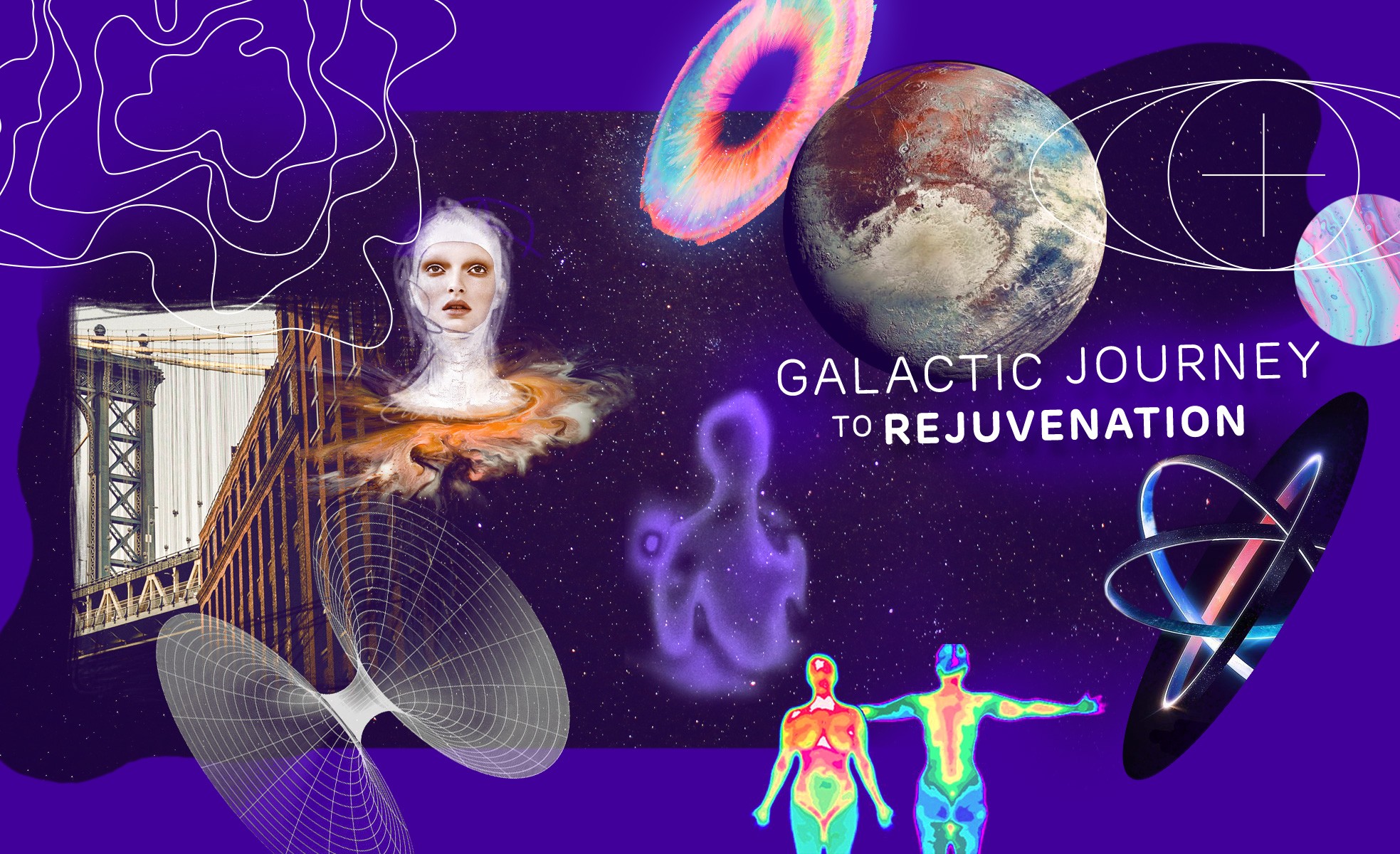
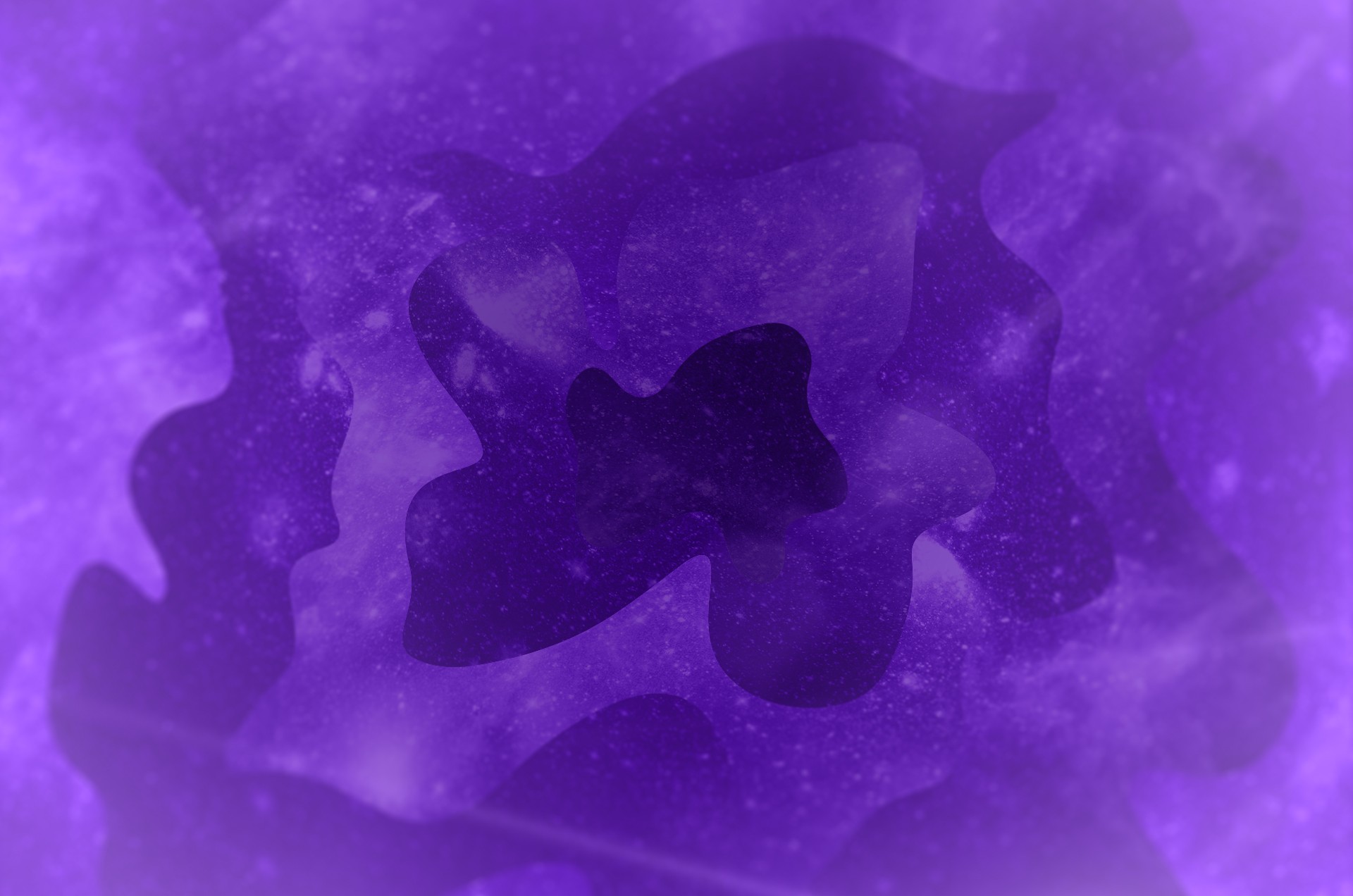
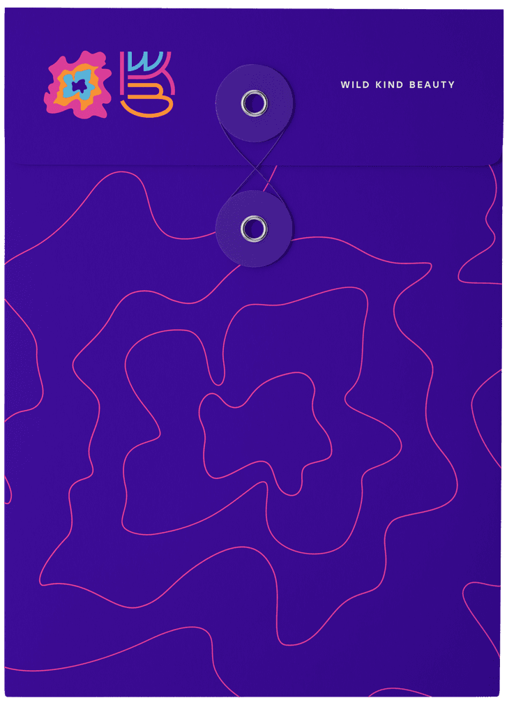
Inspired by the gravitational pull of change, we envisioned WKB as the portal to transformation. The brand identity draws from wormholes and cosmic gateways, capturing the experience of stepping into one state and emerging renewed.
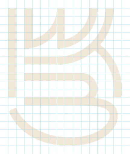
At the heart of this concept is the WKB logomark, a layered and fluid form inspired by black holes and interwoven dimensions. This abstract visual structure represents a gateway—an immersive, multi-dimensional experience that redefines beauty beyond the surface.
Inspired by the gravitational pull of change, we envisioned WKB as the portal to transformation. The brand identity draws from wormholes and cosmic gateways, capturing the experience of stepping into one state and emerging renewed.
At the heart of this concept is the WKB logomark, a layered and fluid form inspired by black holes and interwoven dimensions. This abstract visual structure represents a gateway—an immersive, multi-dimensional experience that redefines beauty beyond the surface.


PANTONE VIOLET C
#410099
PANTONE 305C
#54C8E8
PANTONE 1605C
#ED40A9
PANTONE 1495C
#FF9015
CMYK
C:%5 M:%0 Y:%5 K:%10
#D9E1DC
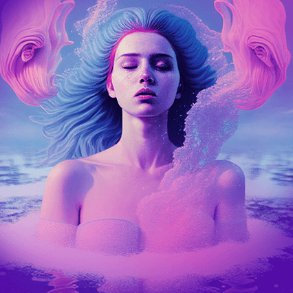
The palette—deep violet, cyan, pink, and orange—evokes the mystery and vibrancy of galactic transitions, symbolizing the fluid energy of change. Complementing this, the WKB monogram was designed using a condensed typographic system, reflecting the precision and artistry of beauty treatments while maintaining an organic, flowing rhythm.
Wild Kind Beauty’s new identity is more than a visual refresh—it’s an immersive passage into self-discovery, where every transformation feels like a cosmic shift.


WKB
HEALTH | BEAUTY
REBRANDING BRAND BOOK LABEL SIGNAGE CONTENT


CREATIVE DIRECTION • BRANDING • BRAND STRATEGY • GRAPHIC DESIGN • MOTION-GRAPHICS
2022

SERVICES
CREATIVE DIRECTION BRANDING BRAND STRATEGY GRAPHIC DESIGN MOTION-GRAPHICS
2022
Creative communiation + Image making